DO YOU HAVE DOUBTS ON HOW TO CHOOSE THE SHADES OF COLORS OF THE INTERIOR OF YOUR HOME? THIS ARTICLE WILL DISSOLVE SOME PERPLEXITY FOR THE CHOICE OF THE PERFECT COLOR COMBINATION.
We won’t be the ones to say there’s a right or wrong way to choose colors for your home décor, but if you’re here, we think you need a helping hand. If you can’t get out of the impasse, it’s time to consider the 60-30-10 color rule. We will guide you through this interior design technique, which will give your home a harmonious look and the ability to last longer.
Beyond preferences and tastes, colors that are not matched with each other could make you feel uncomfortable in a home. The eyes perceive only disorder, confusion and color dissonances. That’s why among the first tips we give, as an architect and interior designer, to furnish any room, there is always the study of chromatic shades. Choosing a common color palette for the whole house helps to harmonize the entire décor.
In the visual arts there are some rules that can help us. The 60-30-10 interior design technique is a proven method that builds on some of those rules and helps you come up with a harmonious color scheme for your entire home. It is not an abstract methodology, but on the contrary, it is applied in many real cases. Professionals often use it in an “unconscious” way, having a cultural background and a solid base of training and experience, from which to draw.
Most likely, you have already read something about it here on our blog, but we decided to delve deeper into the topic, because it often seems like a more complicated concept than it actually is.
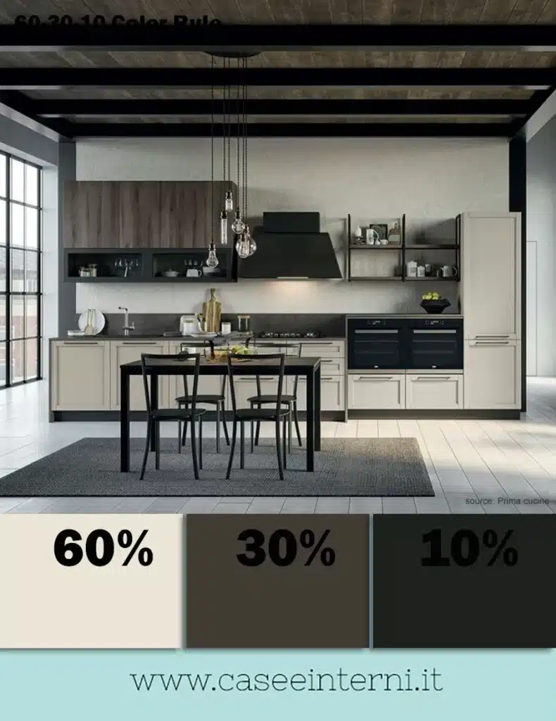
WHAT IS THE 60-30-10 COLOR RULE IN INTERIOR DESIGN
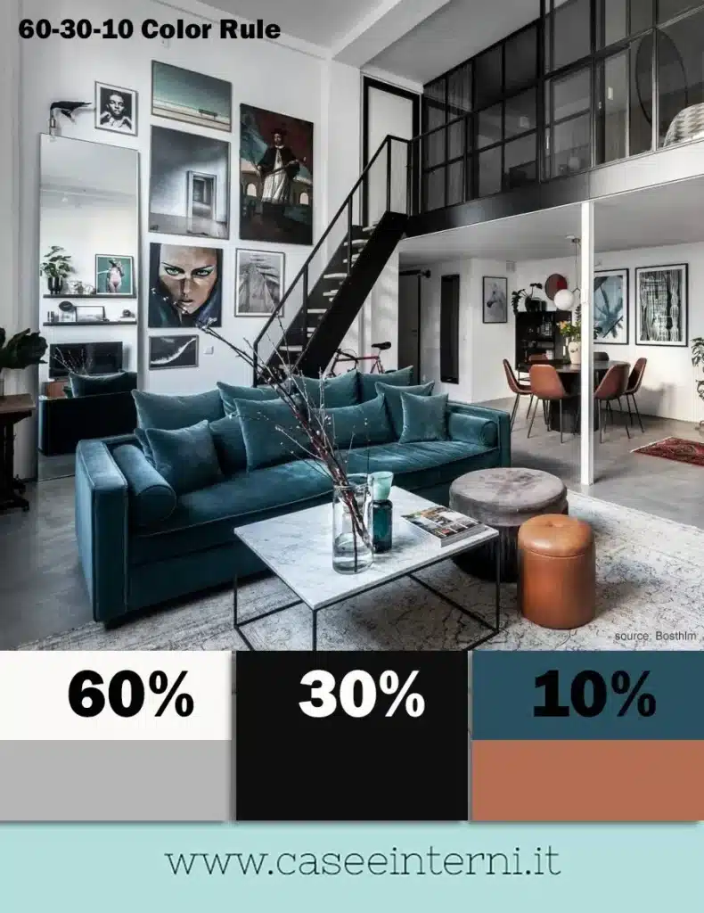
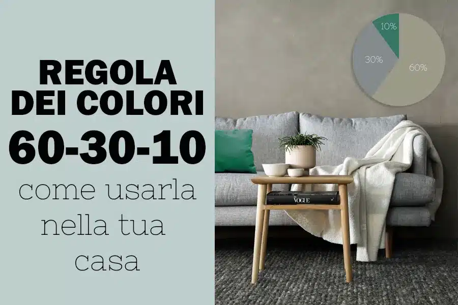
The 60-30-10 color technique is about how colors should be adjusted proportionally, within the environment, to achieve a balanced and harmonious atmosphere. With the 60-30-10 rule, even non-professionals can make sure that the colors are in the right proportions. If you’re in a pinch, use it and you can’t go wrong. Here’s how it works…
A house or a room will be in perfect chromatic harmony if:
- 60% of the chromatic presence is given by the primary color
- 30% of the chromatic presence is given by the secondary color
- 10% of the chromatic presence is given by the accent color
It is not a rigid and categorical rule, in the sense that you are not obliged to choose only 3 colors, but if you define the main shades, it will be easier to find shades in harmony for each individual area.
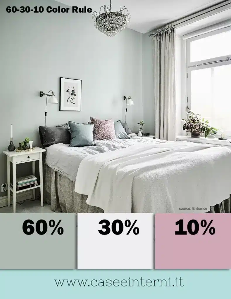
60%: PRIMARY COLOR
The main color you have selected for your spaces should represent 60% of the color inside the room or, even better, the whole house.
This percentage is represented by the color of the walls, the ceiling and in some cases the largest furniture such as the kitchen furniture or the wardrobe in the room or the most present elements such as curtains, if there are large windows.
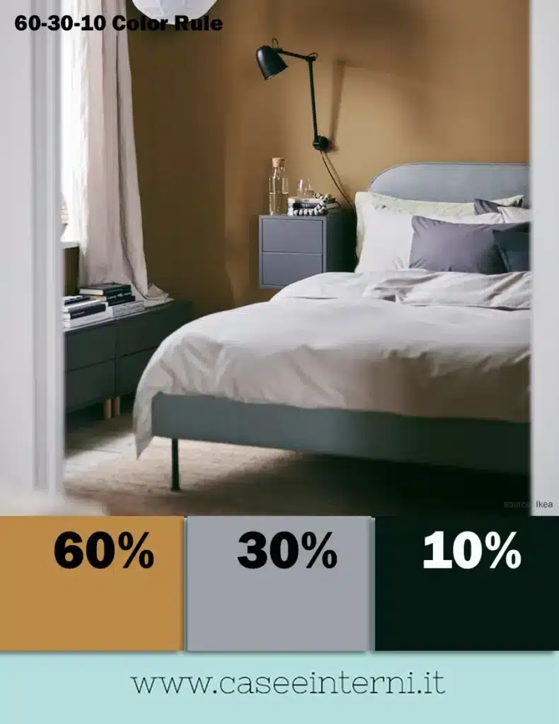
Essentially, the primary color should serve as the dominant color in the room. Generally, they are neutral and light colors, which help to create a bright background in the room and highlight other colors. The range of whites, grays, and beiges are the most used for this purpose. However, you can also find light desaturated colors, as in the photo above.
30%: SECONDARY COLOR
This is a secondary color, which should have about half the presence of the main color.
In a house or room, this nuance can come from the floor, furniture, a large carpet, sometimes curtains, a large piece of furniture (such as a sofa or bed), or a single wall. These elements of the house play a supporting role to create an elegant and harmonious look. The goal is to make the secondary color enhance the main color within the environment, adding contrast and depth.
Here the range of colors is wider than the previous one, although we tend to use neutral colors, but darker or colors that are not bright. For example, black, dark gray, brown in all its shades (especially that of wood essences), pastel tones or desaturated colors. It is not uncommon to choose to use two secondary colors, but they have a similar impact (wooden floor and dark gray sofa, for example).
10%: ACCENT COLOR
This percentage represents what we call accent colors in jargon, i.e. those elements of furniture in charge of “attracting attention”.
In your home, for example, your accessories, complements and textiles can provide colour details. Generally, 10% is represented by some of these elements: cushions, decorations, paintings, throws, but they could also be a coffee table, a chair, an armchair, etc.
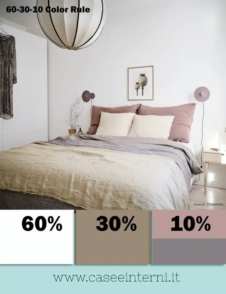
It can be a lively or muted tone, depending on the look you want to achieve.
There are situations where one accent color is not enough, so it could be two colors (5%+5%), but know that it is more difficult to match them. A quick trick is to extrapolate the two colors from a patterned element chosen to furnish, in order to tie in with the rest: for example, these shades could be taken from a pattern of linen (if we are in the bedroom), a kilim or modern rug, if we are talking about the living room, but also from a large painting or a pillow.
These are colors that will be representative of your personality. Normally bright colors tire more easily than others, however, following this rule, we could change them in the future with other colors, rather quickly and cheaply, because we would only have to replace those small details.
As you can see, it is a very simple and easy to apply technique. We just need to know the colors we want to match or if there are already colors present, which we don’t want to change from which to start (for example the floor, a wardrobe, etc.).
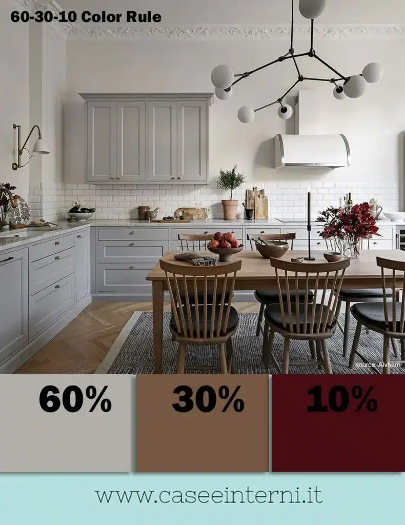
Here are some more practical examples that show the 60-30-10 color rule in use…
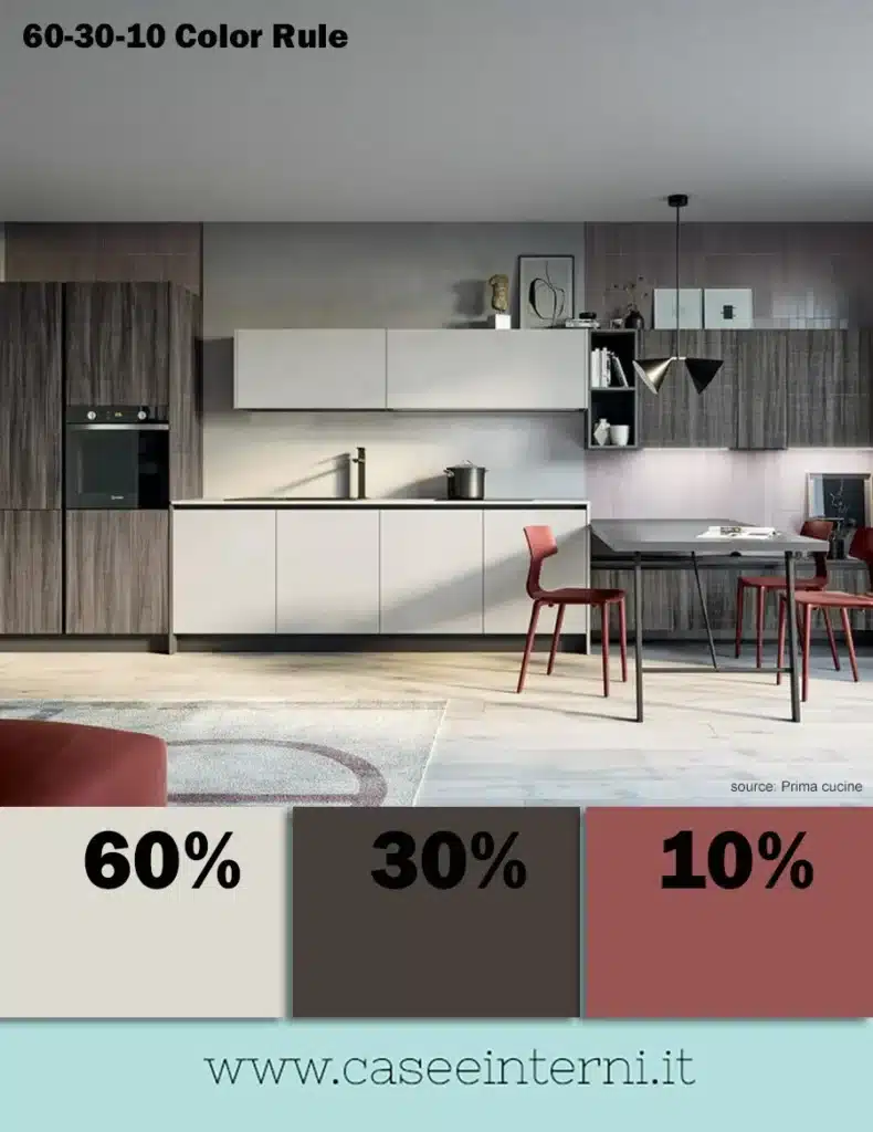
Fonte / Source: www.caseeinterni.it
